Reducing barriers to essential reproductive and sexual health products for college students.
Designing a physically and digitally embodied kiosk concept offering private, 24/7 access to reproductive and sexual health products and resources on the UC San Diego campus.
7 MIN READ


Project Details
TEAM
ROLE
Lead Digital Product Designer UX Researcher
AFFILIATION
DSGN 100 (Prototyping)
at UC San Diego
TIMELINE
4 Weeks
TOOLS
Figma
CONTRIBUTIONS
Interaction design
Digital prototyping
UX design
Usability testing
Field research
01. INTRODUCTION
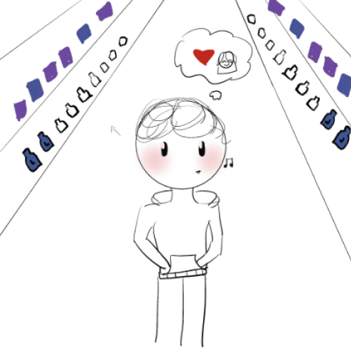
Reproductive and sexual health is treated as a hush-hush issue.
From personal experience and anecdotes from our peers, we’ve observed many college students have encountered difficulties in obtaining products like emergency contraceptives and menstrual products outside of standard business hours.
The challenge for our final project was to design a physically and digitally embodied kiosk that solves a real problem. Given that college campuses often lack readily available resources for reproductive and sexual health, we decided to explore how a kiosk might bridge this gap in accessibility to essential products.
But first, we needed to validate our assumptions to confirm that this was a real issue.
02. UNEARTHING A PROBLEM
Validating our assumptions.
To better understand people’s experiences with accessing reproductive health products and contraceptives, we conducted a survey of 67 respondents. Our respondents ranged from ages 17 to 36, with the median age being 21 years old. To get geographically diverse insights, we recruited respondents from both the west and east coasts.
Top accessibility barriers
for accessing contraceptives and reproductive health products.
Most common access points
Pharmacies
33 out of 67 respondents indicated that they obtain contraceptives or reproductive health products at a pharmacy.
Convenience stores
25 out of 67 respondents indicated that they obtain contraceptives or reproductive health products at convenience stores.
Clinics
24 out of 67 respondents indicated that they obtain contraceptives or reproductive health products at a doctor’s office or health clinic.
Most commonly purchased products
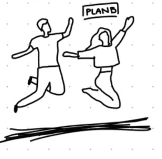
Plan B (56)
56 out of 67 respondents indicated that they would like to access Plan B in a hypothetical kiosk.
Pregnancy tests (54)
54 out of 67 respondents indicated that they would like to access pregnancy tests in a hypothetical kiosk.
Condoms (51)
51 out of 67 respondents indicated that they would like to access condoms in a hypothetical kiosk.
Menstrual hygiene (51)
51 out of 67 respondents indicated that they would like to access menstrual hygiene products in a hypothetical kiosk.
Quick insights from existing research.
To ensure that this problem extended beyond the scope of college students, we conducted intensive secondary research to examine current issues with reproductive and sexual health accessibility and awareness.
About 45% of women experienced at least one barrier to reproductive healthcare services in 2021, and nearly 19% reported at least three barriers [1].
Health kiosks make provision of services and supply of medicines cheaper, faster, and easier [2].
In a systematic review of studies on types of kiosks and services they provided (37 total in 2020), none mentioned reproductive healthcare [2].
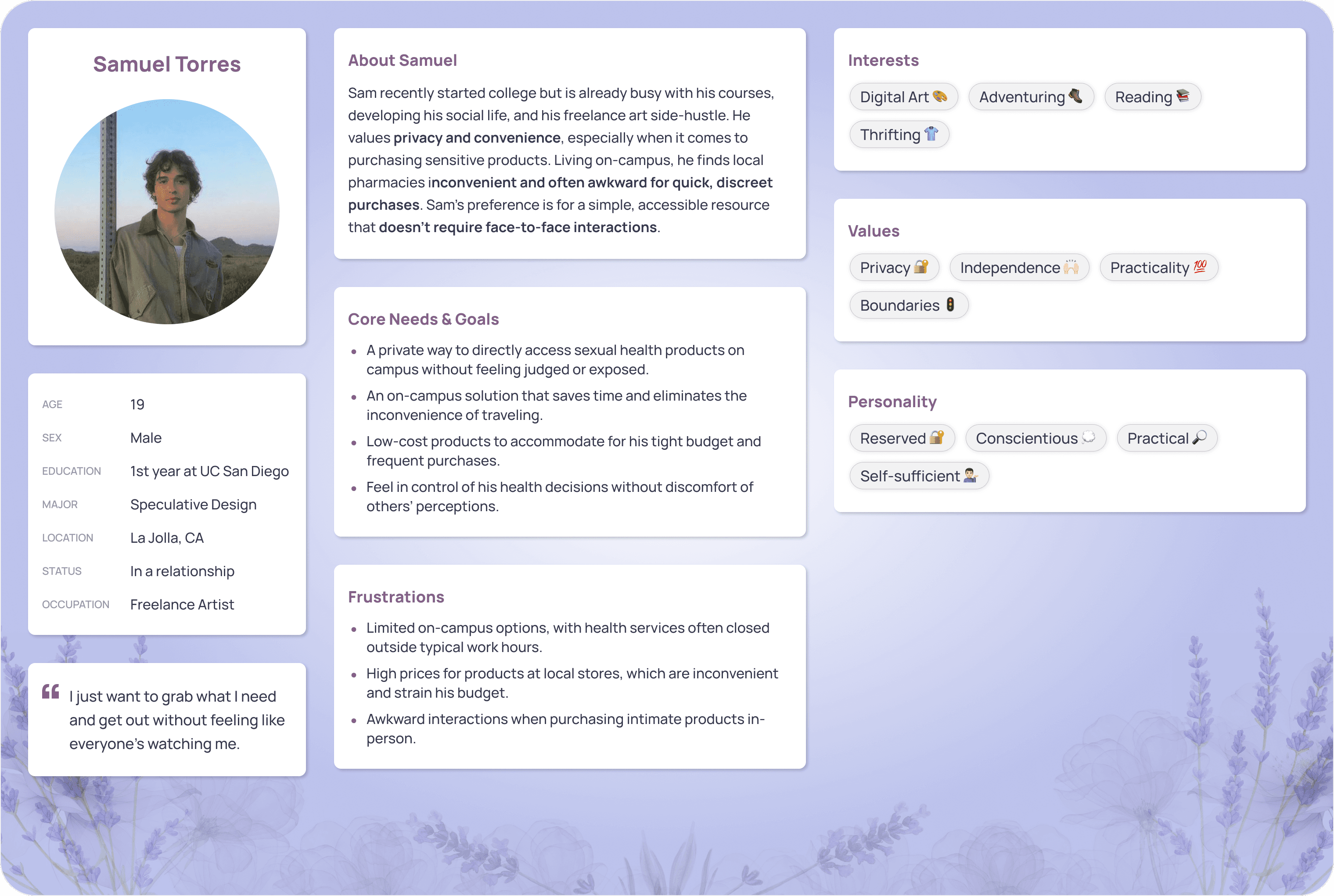
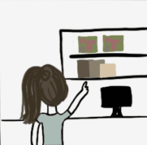
After surveying attitudes/needs from our target audience and compiling secondary research, our team began to visualize our product’s user experience using primary/secondary user personas and storyboards.
We would show these storyboards to our interviews with students, campus employees, and health professionals to see if these scenarios resonated with them and inquire about potentially missed use cases.

PRIMARY PERSONA
SECONDARY PERSONA
Turning to the field for professional insights.
To cover all of our bases on the feasibility of a kiosk that addresses a gap in accessibility to reproductive and sexual health products, we contacted and interviewed community members and professional health advocates.

Assistant Director for Education
UC San Diego Women’s Center

Student Employees
General Store at UC San Diego
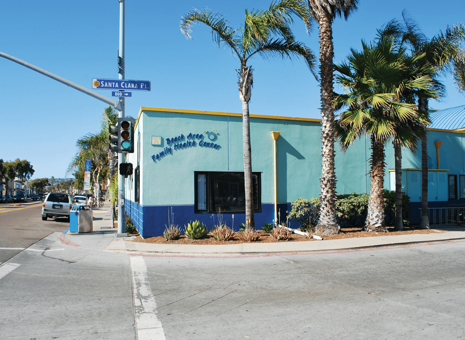
Director of Operations
Beach Area Family Health Center
Key storyboard insights
Cross-validating our assumptions about our product’s value and impact with interviewees.
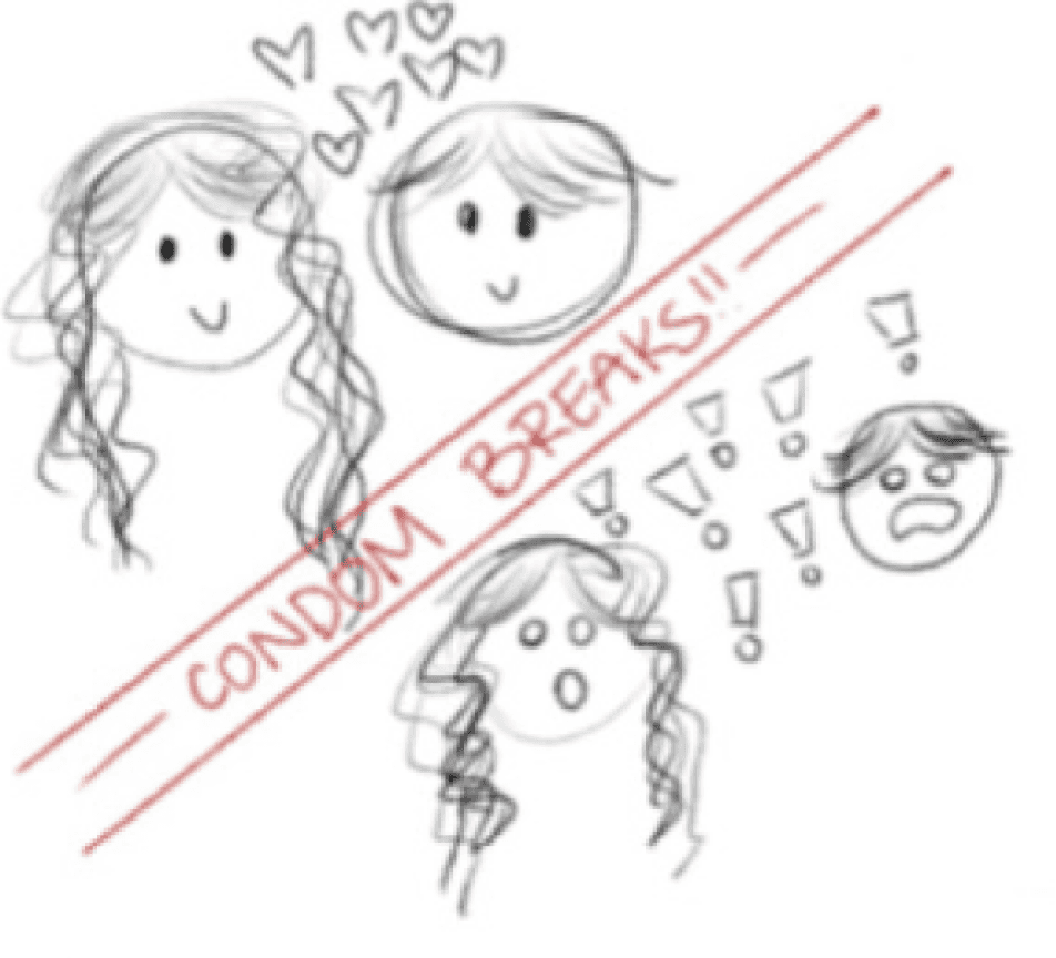
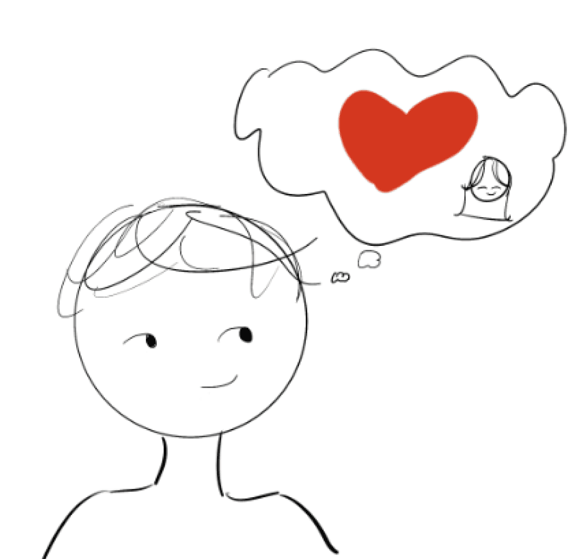
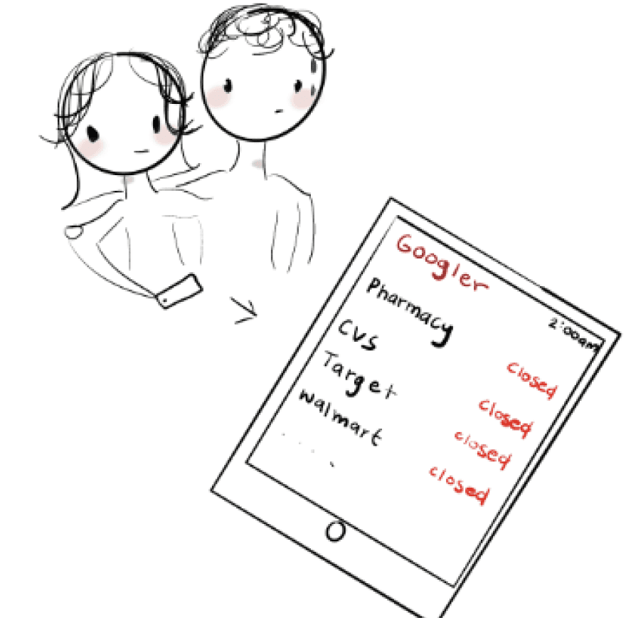
Storyboard 1 Insights
Interviewees strongly resonated with the panic of needing Plan B late at night and the stress of not being able to access it quickly. They appreciated the idea of having private, 24/7 access on campus, especially in urgent, high-stress situations.


Storyboard 2 Insights
Multiple interviewees related to the embarrassment and stigma of buying sexual health products in public. They felt the kiosk’s discreet, judgment-free experience would make it much easier and more comfortable to prioritize safe sex.


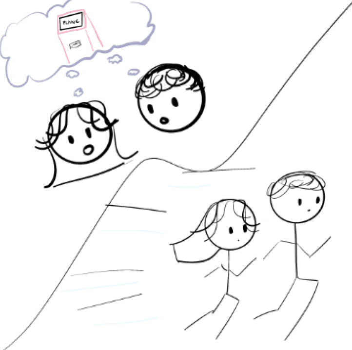
Storyboard 3 Insights
Several interviewees shared that they or their friends had struggled with the cost of emergency contraception, especially without insurance. They resonated deeply with the scenario of not being able to afford Plan B and emphasized how impactful an affordable on-campus option would be.


Storyboard 4 Insights
Interviewees connected with the urgency of needing condoms at night and not having access due to store closures or transit limitations. They appreciated that the kiosk could remove logistical barriers, helping them act on their values around safe sex.


Key interview takeaways
Identifying the most important issues for accessing sexual and reproductive health products.
Education
Some products have significant side effects that people must be aware of before taking them. Offering support and educational resources is essential to protecting the health of our users.
Privacy
Stigma can be paralyzing for taking action. Protecting the privacy of our users ensures their comfortability.
Safety
Ensure that people are safely and properly using these products and encourage seeking help from medical professionals.
Adjusting our product vision.
In our interview with Hannah Aksamit M.Ed., the Assistant Director for Education at the UCSD Women’s Center, some very important concerns for dispensing birth control were brought up.
While birth control can be incredibly helpful, it can also be very taxing and even damaging to the body. It’s highly recommended to seek professional medical assistance to figure out which type of birth control is right for an individual.
Hannah places a heavy emphasis on the need to connect our users with medical professionals and the importance of education. As a result, we narrowed our scope to over-the-counter (OTC) reproductive and sexual health products. To address the need for education on these products, we decided to include a localized resource library for reproductive and sexual health care.
Prescribed contraceptives
• Hormonal: pill, patch, implant, injection, some IUDs
• May have serious health side effects for those with pre-existing conditions
OTC Reproductive and sexual health products
• Emergency contraceptives (Plan B)
• Over-the-counter birth control (Opill)
• Menstrual hygiene products
• Condoms
• Lubrication
• Pregnancy tests
Localized resource library for reproductive and sexual health
• Guiding users toward poorly advertised resources
• How to best address one’s reproductive and sexual health needs
• Contact information for medical professionals
Our extensive research of issues surrounded access to reproductive and sexual health products and observed user interest suggests that a kiosk could be a viable solution.
When it comes to accessing reproductive and sexual health products, people highly value privacy, discretion, and affordability. In order to design a kiosk that people want to use, it is imperative that we create a kiosk design that feels secure and non-judgmental.

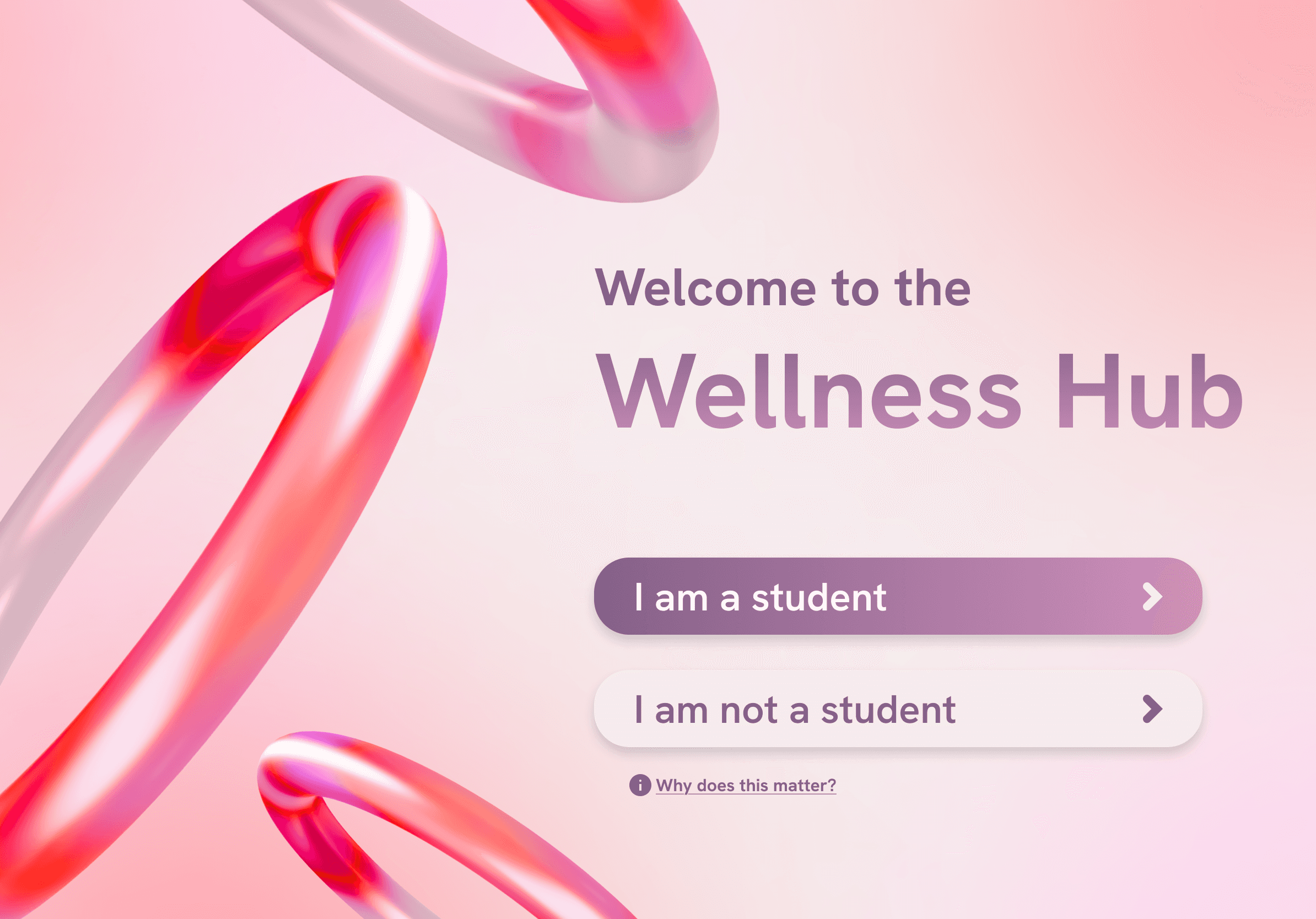
MISSION STATEMENT
We aim to design a 24/7 interactive kiosk at UC San Diego to provide students with private, affordable, and discreet access to essential reproductive and sexual health products and resources to reduce barriers and promote well-being.
03. DESIGN IDEATION
Beginning to build out our vision.
At this stage, we began to ideate on our solution with sketches, low-fidelity, mid-fidelity, and high-fidelity prototypes.
Rapidly ideating on our solution
One of the things I find most helpful for rapid ideation on a solution is to sketch, sketch, and then sketch again. Sketching with pen and paper helps me not overthink the small details while exploring many different layouts and flows.
Sketches for the digital interface
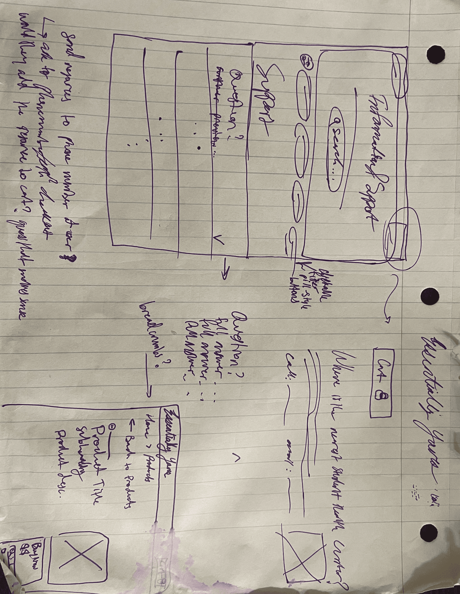
PHOTO: LOCALIZED RESOURCE LIBRARY SKETCH
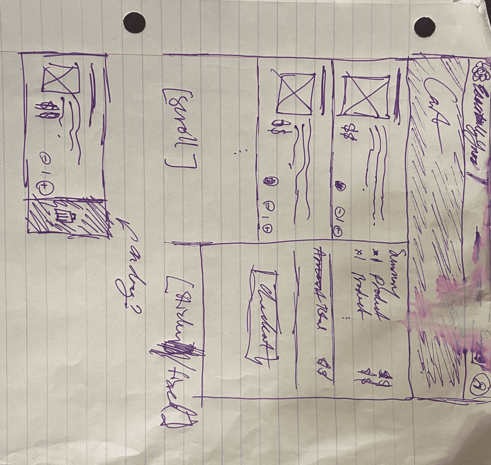
PHOTO: CHECKOUT CART SKETCH

PHOTO: EARLY-STAGE CONCEPT SKETCH
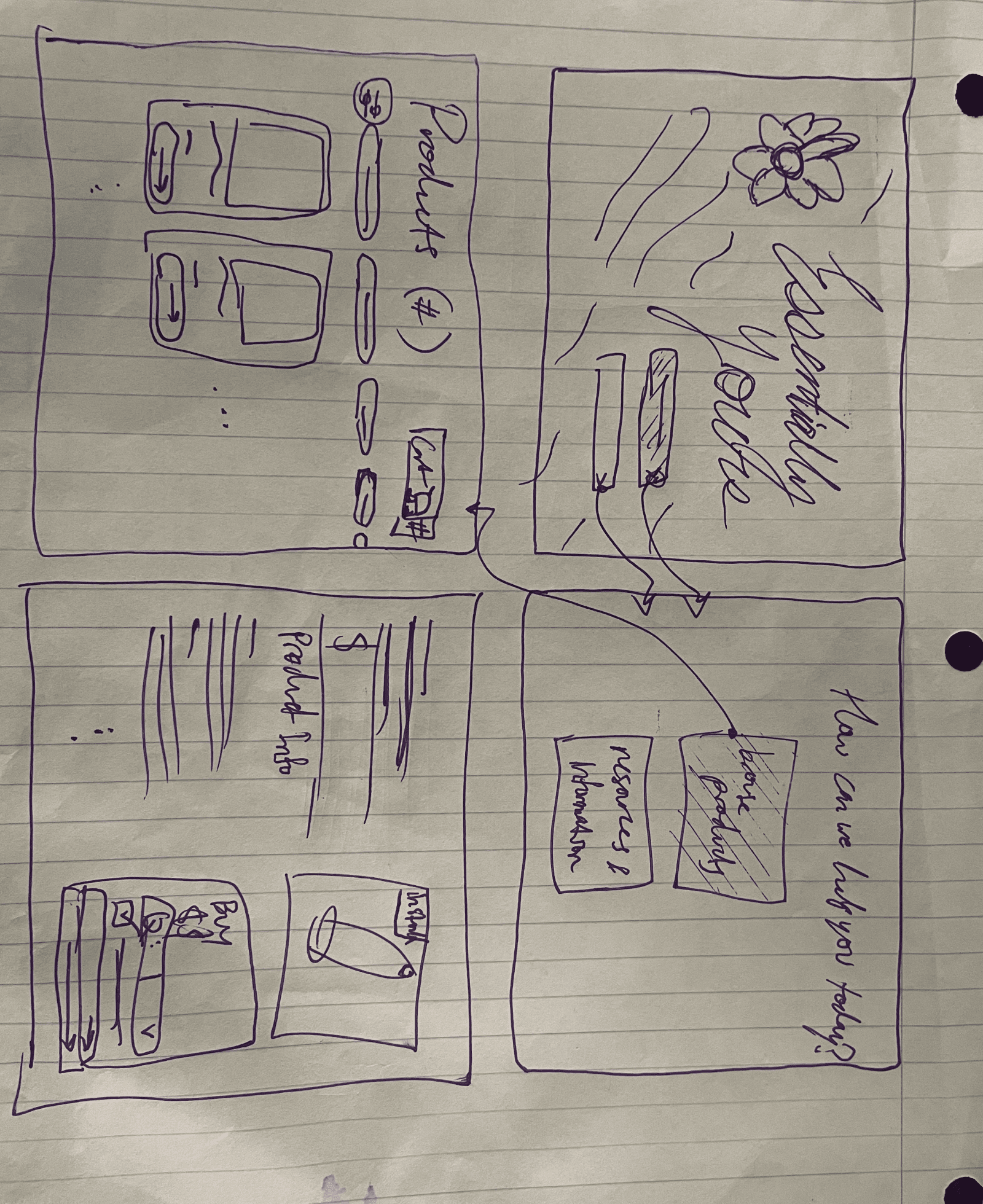
PHOTO: “BROWSE PRODUCTS” FLOW SKETCH

PHOTO: RESOURCE SKETCH

IMAGE: PRODUCT CONCEPT SKETCH 1

IMAGE: PRODUCT CONCEPT SKETCH 2

IMAGE: NAVIGATION BAR SKETCH
Sketches for the physical interface

IMAGE: KIOSK CONCEPT SKETCH
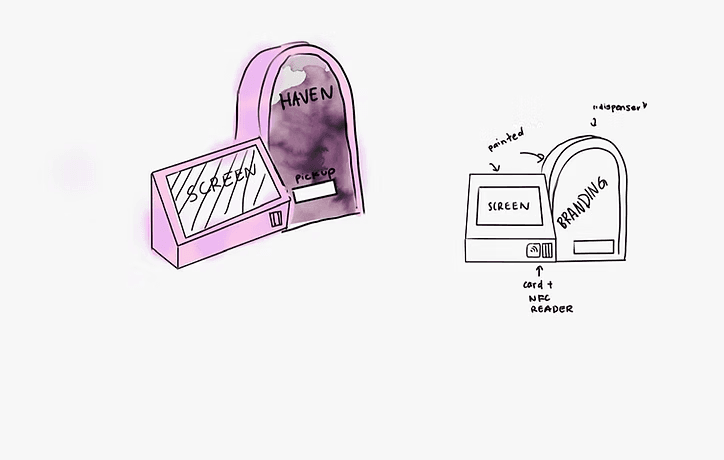
IMAGE: FINAL KIOSK CONCEPT SKETCH
Low-fidelity prototype
The goal for our low-fidelity prototype was to test our initial flow at a very basic level. Our flow was intuitive, but the lack of details left usability testing participants confused. We expand on these details as the designs move toward a higher fidelity due to the fast-paced nature of this project.

IMAGE: LOW-FIDELITY PROTOTYPE
Mid-fidelity prototype

IMAGE: MID-FIDELITY PROTOTYPE
Visual design ideation
Determining how we should brand our kiosk was something we thought long and hard about. We went through several iterations before landing on a theme that felt right. Our team felt inclined towards a calming essence that conveys relaxation and peace, and we incorporated this through a floral theme with lavender elements.
ITERATION 1

ITERATION 2

ITERATION 3

FINAL ITERATION
Style guide and branding


FEATURE 01
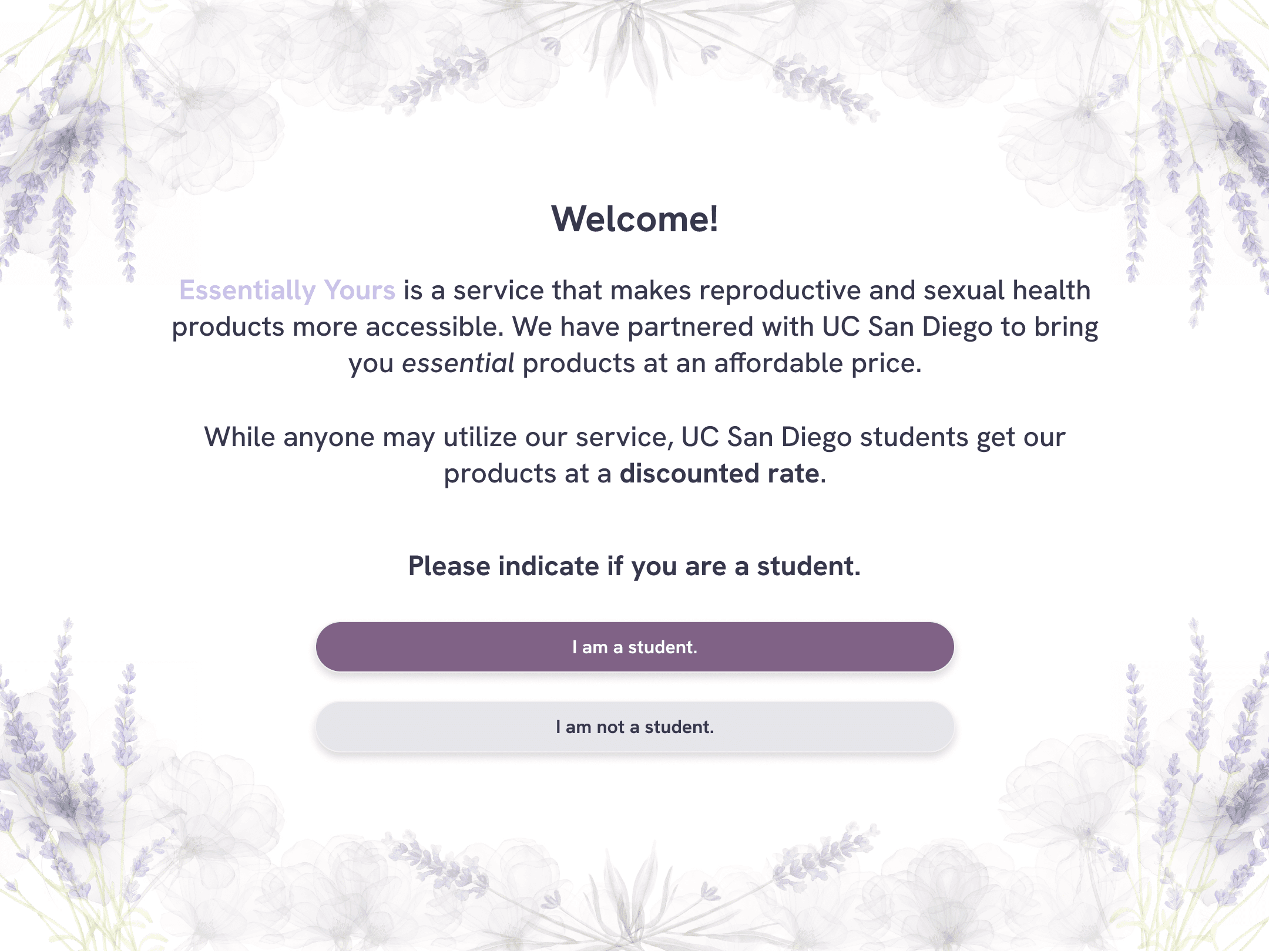
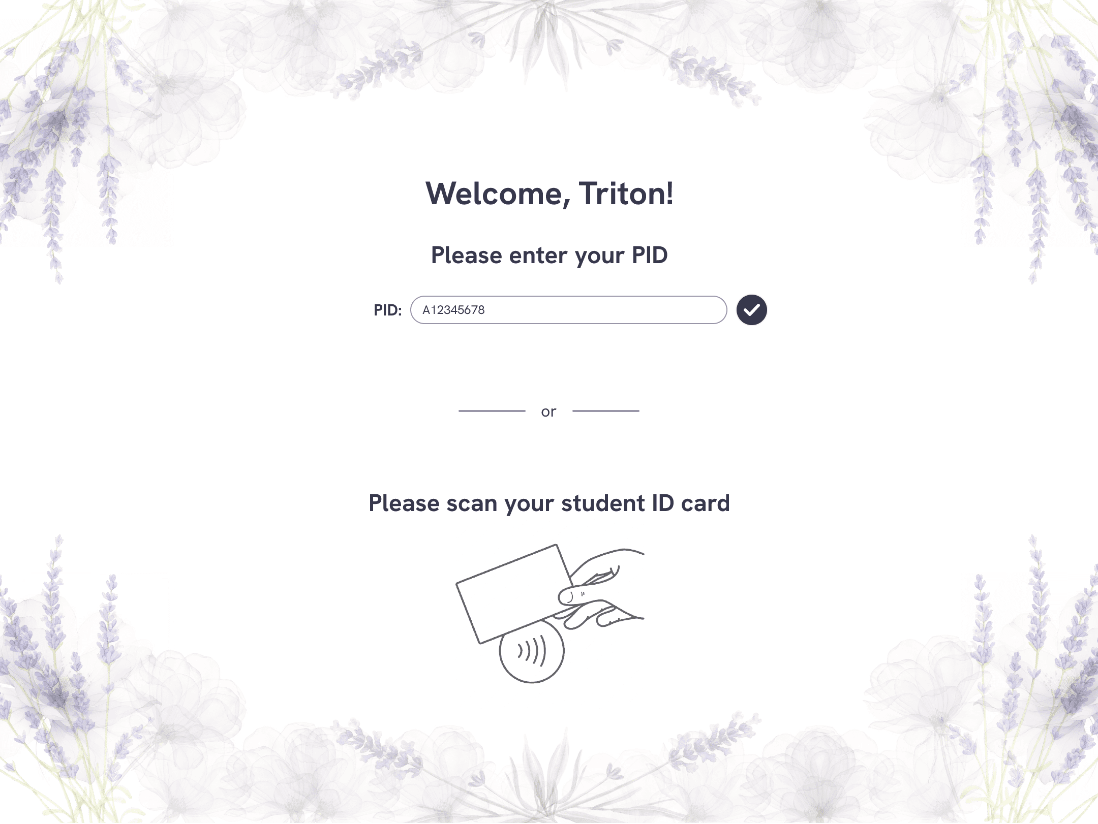
Onboarding
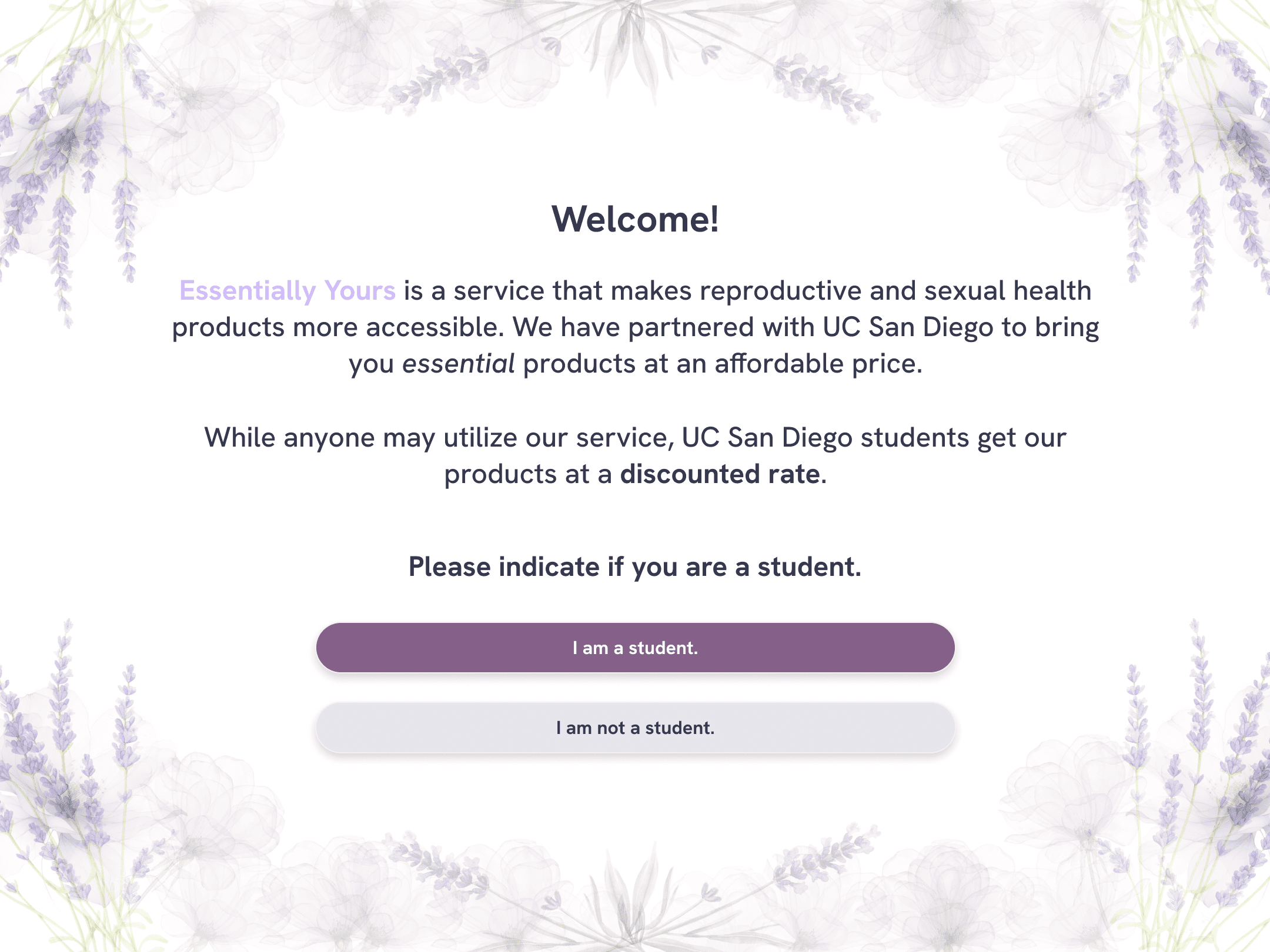
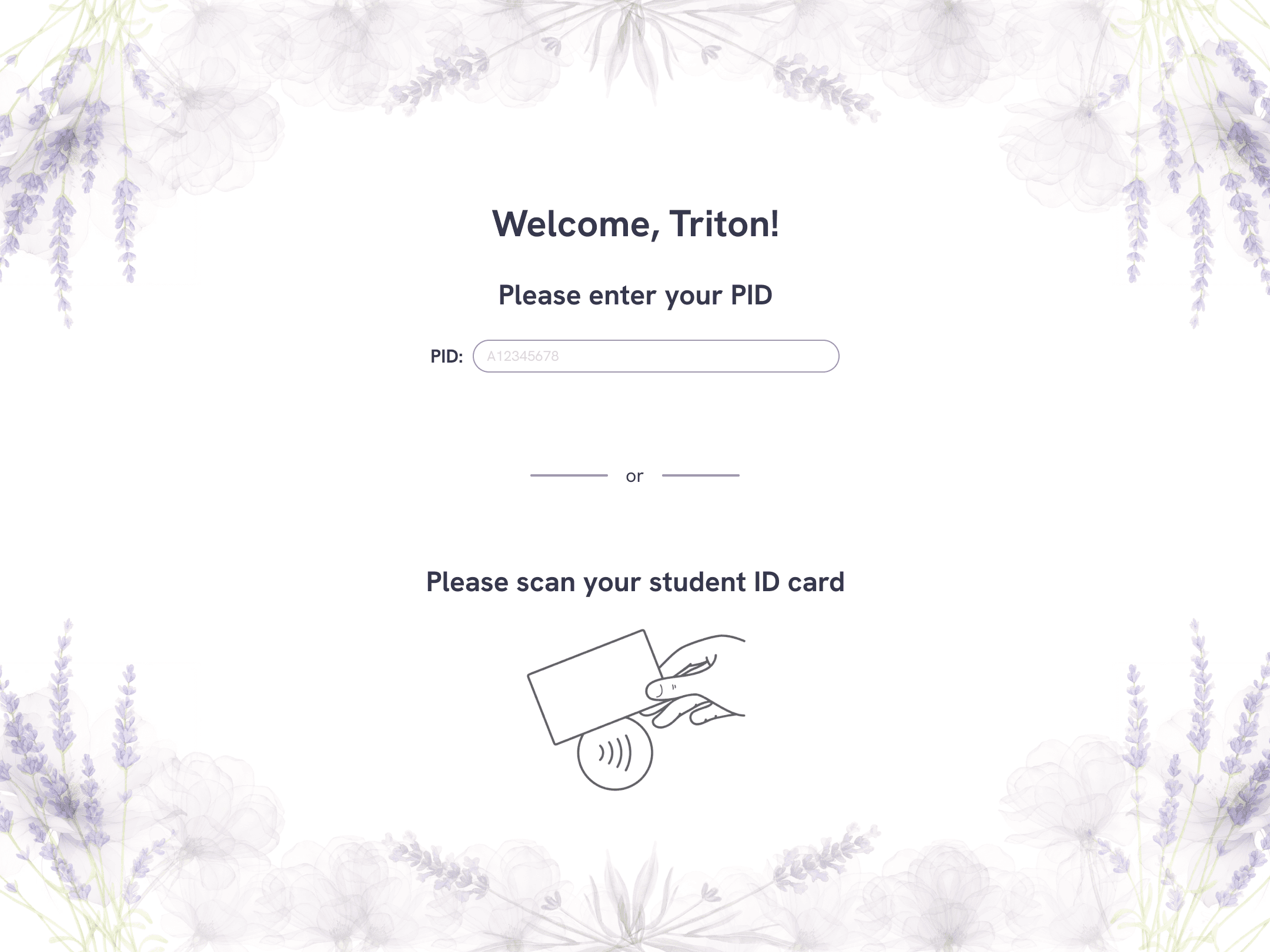
Despite being located on a college campus, our product serves both students and non-students. If a user presents their student ID, they are qualified to receive paid products at a discounted rate.
However, our products are still relatively affordable even without the discount.
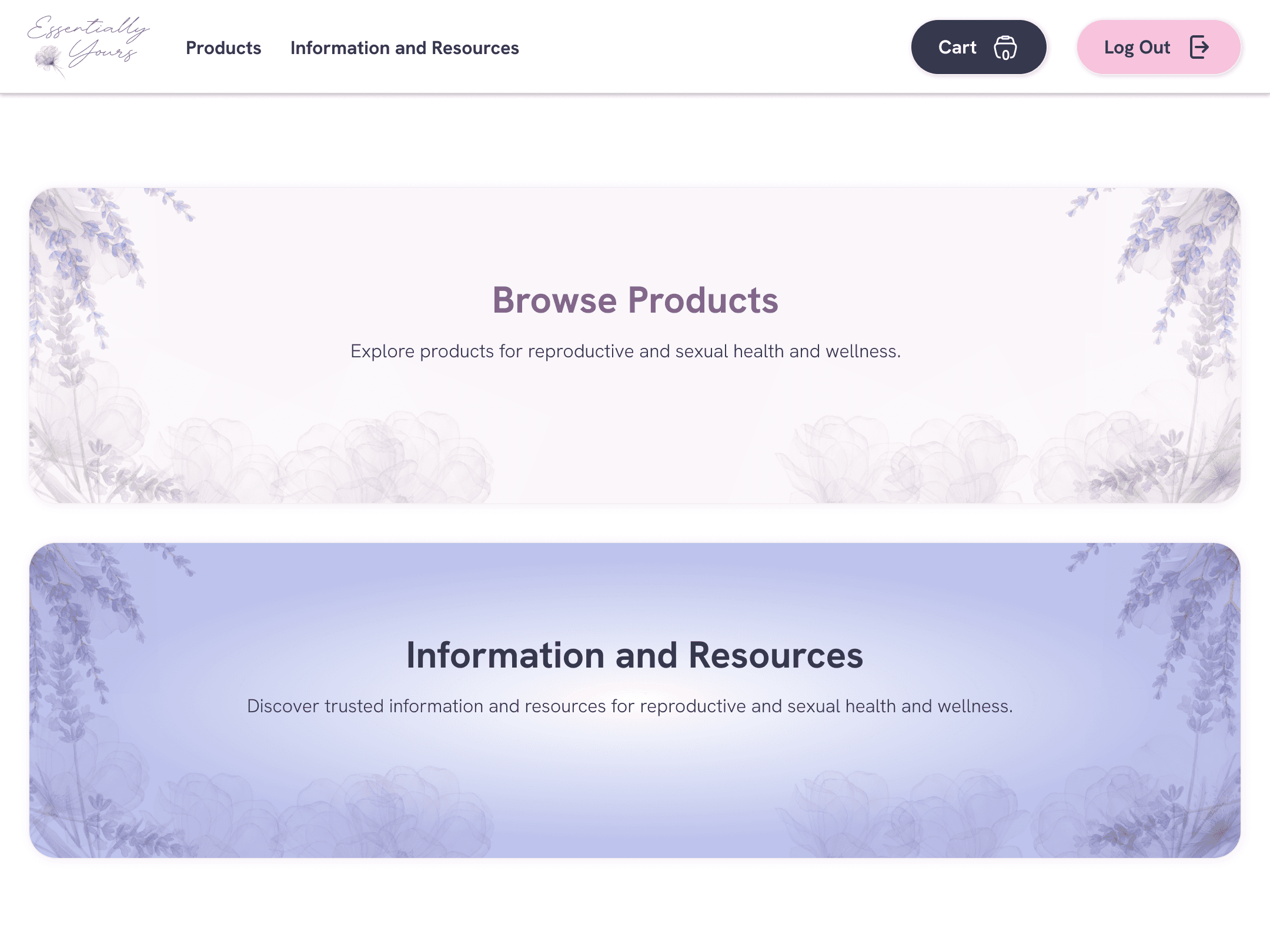
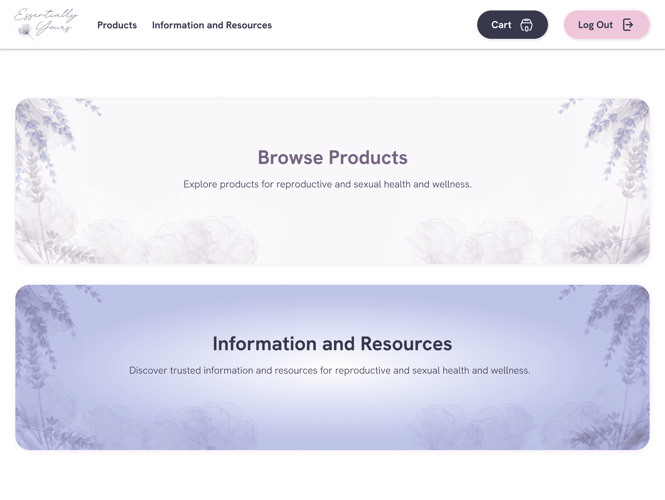
Upon landing on the home page, users have the choice to explore reproductive and sexual health products and/or relevant information and resources.

01.1 IDLE SCREEN
01.2 STUDENT/NON-STUDENT
01.3 STUDENT VERIFICATION
01.4 HOME PAGE
FEATURE 02
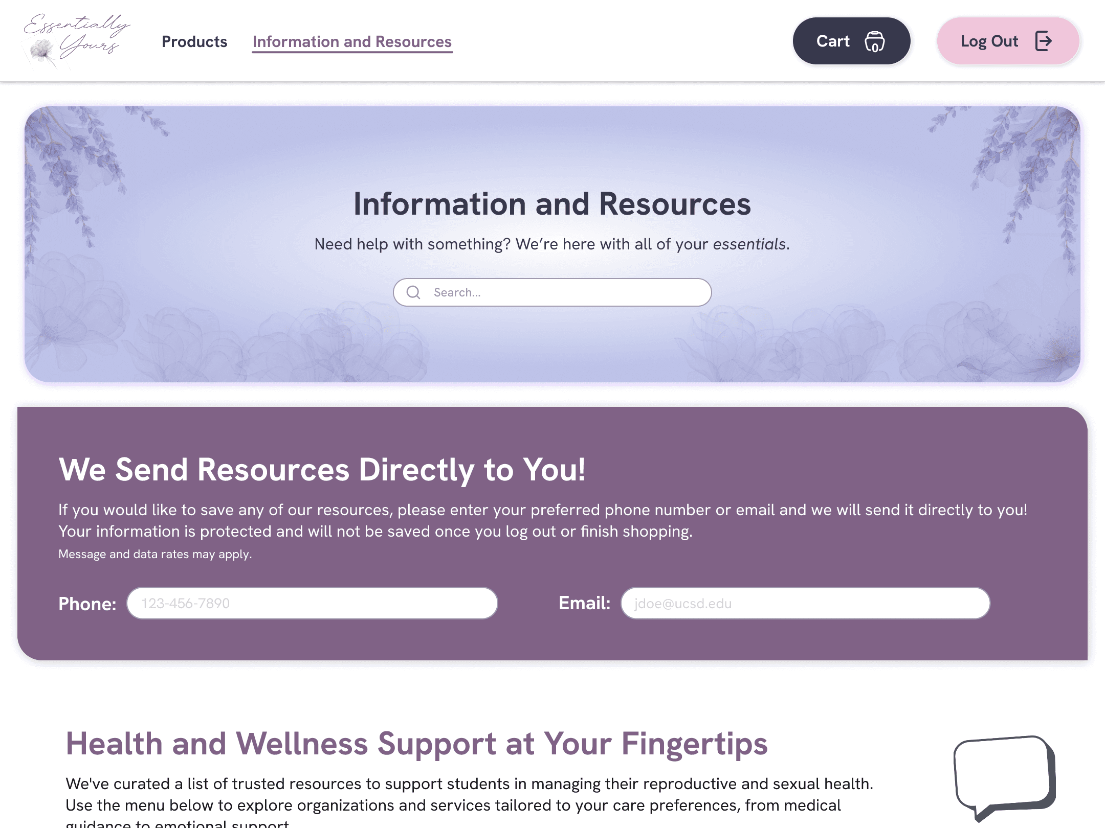
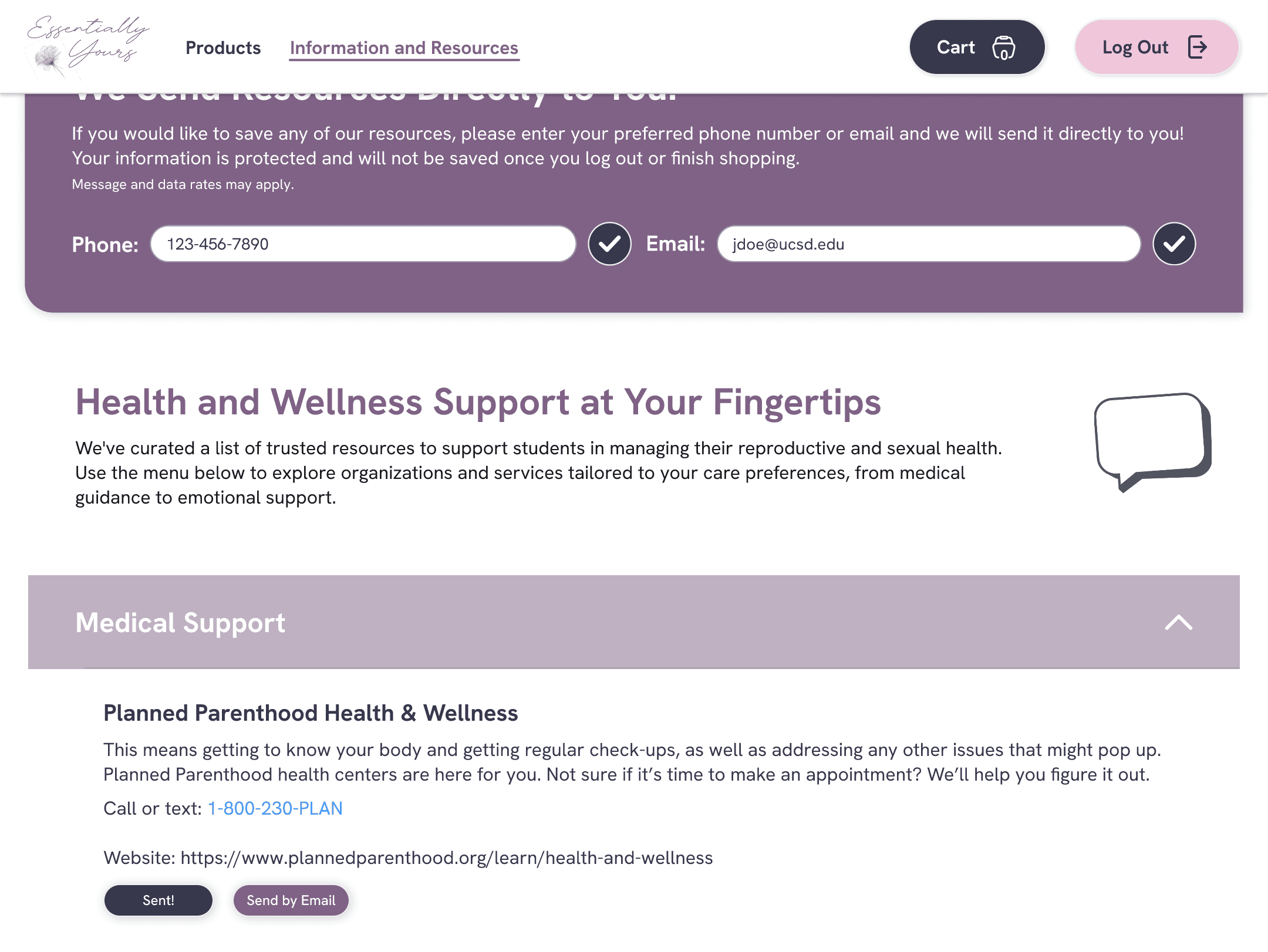
Information and resources page
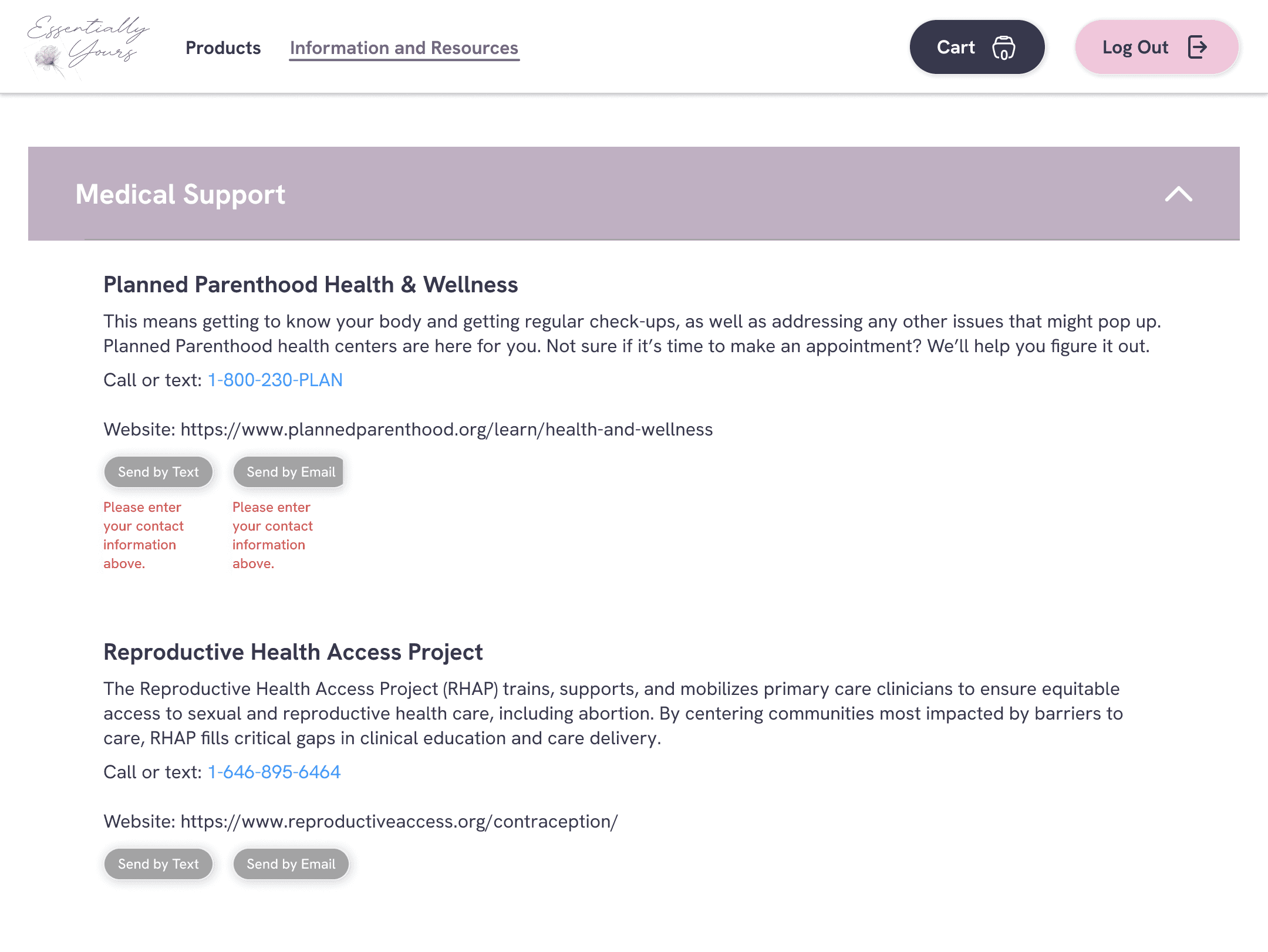
The information and resources page functions as a localized library of resources that are often underrepresented or poorly marketed.
On this page, users are able to send themselves any resource by entering the phone number and email. Distributing resources in this way removes the need to take pictures or save the resources in a note or an external browser.
Our kiosk provides a message on this page that ensures users that their information is protected and secure. Users may not send themselves resources if they do not enter their phone number or email.

02.1 SEND YOURSELF RESOURCES

02.2 RESOURCE LIBRARY
FEATURE 03
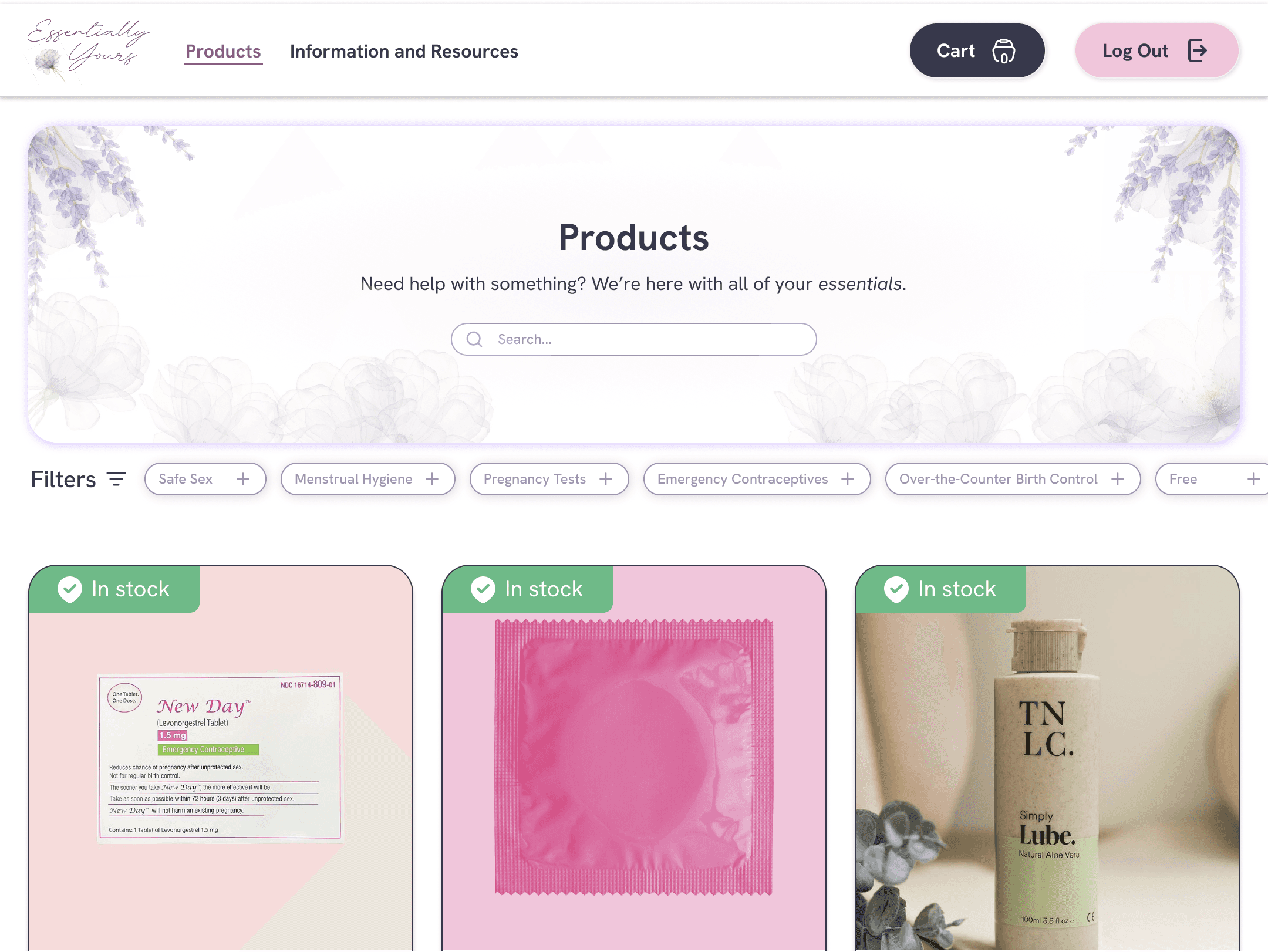
Explore products page
This page serves as a hub for all of the products our kiosk offers. Each card indicates if the product in stock and the price of the product (if applicable). Users can easily find what they’re looking for with filter tags.

03.1 PRODUCT SELECTION

03.2 FILTER TAGS
FEATURE 04
Product descriptions
Our team highly values education and transparency. Each product has it’s own page with product information and drug facts that we require users to read and acknowledge before adding it to their cart. Users also receive a printout of this information when their products are dispensed.

04.1 PRODUCT INFORMATION & DRUG FACTS

04.2 SUGGESTED PRODUCTS
FEATURE 05
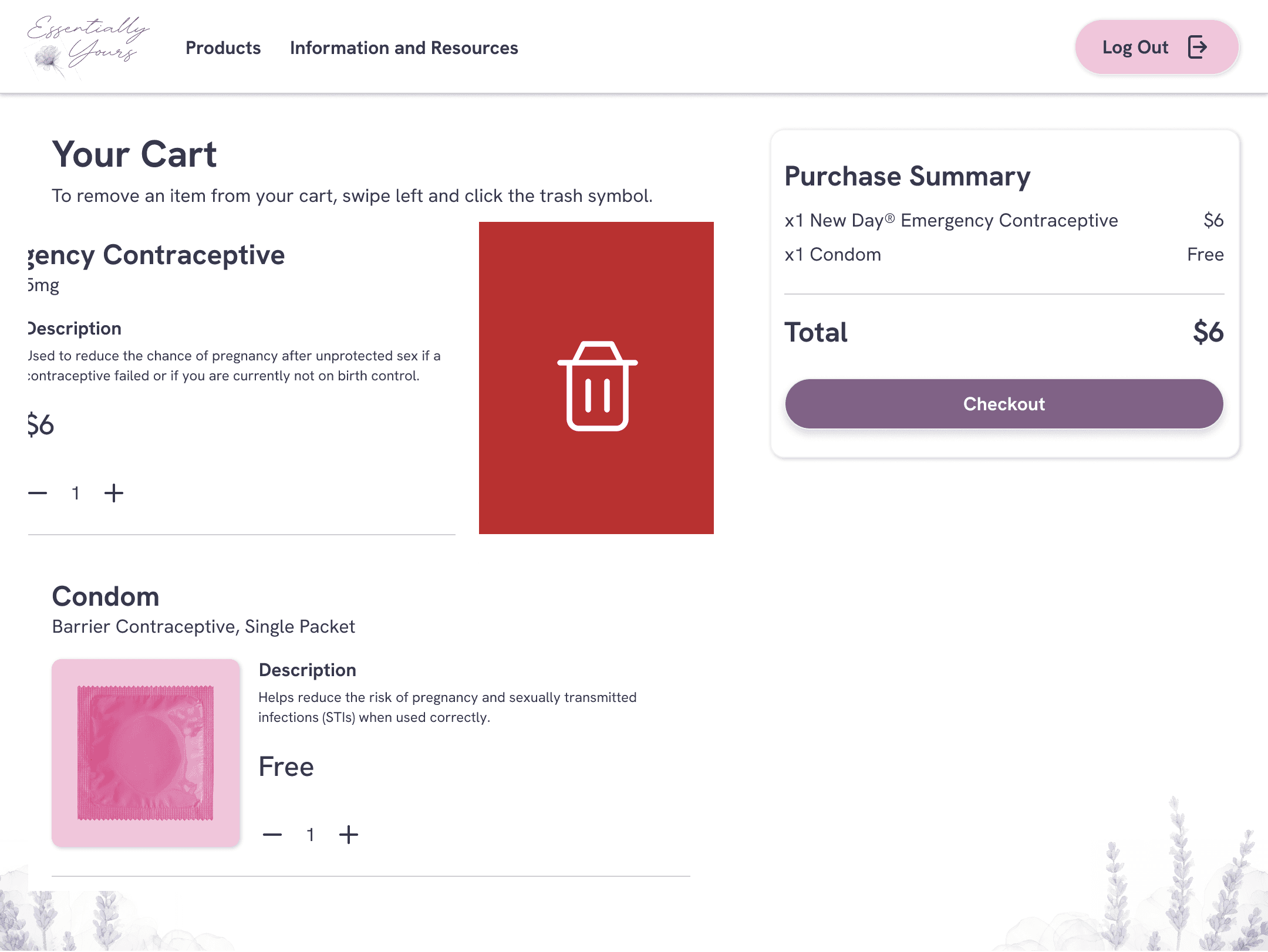
Check-out and off-boarding
Once a user is ready to check out, they can navigate to their cart to begin the process. If their cart is empty, they will be prompted to browse more products.
Payment methods are currently limited to tap-to-pay only. This decision was made due to time constraints to build out other payment methods digitally and integrate it into our physical kiosk.
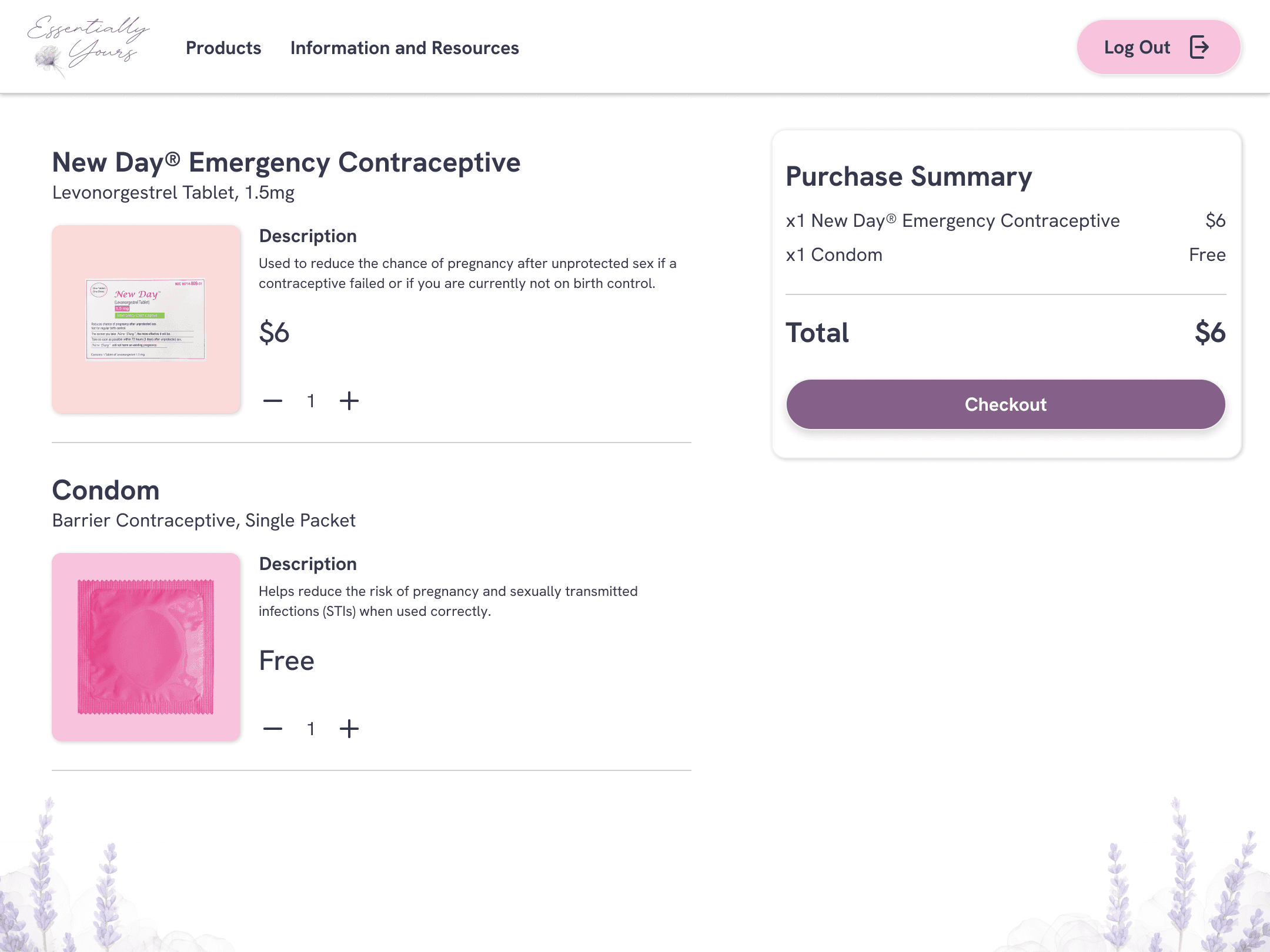
05.1 CHECKOUT
05.2 EMPTY CART

05.3 PAYMENT

05.4 OFF-BOARDING
FEATURE 06
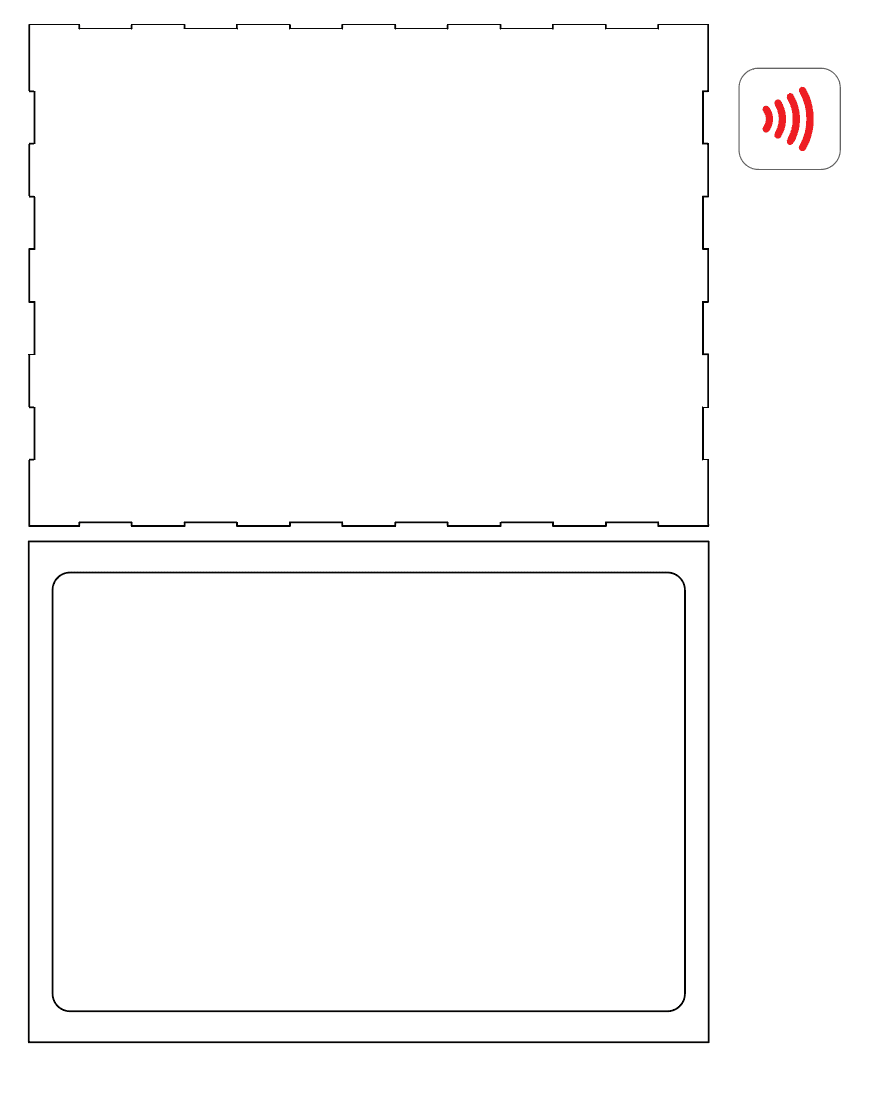
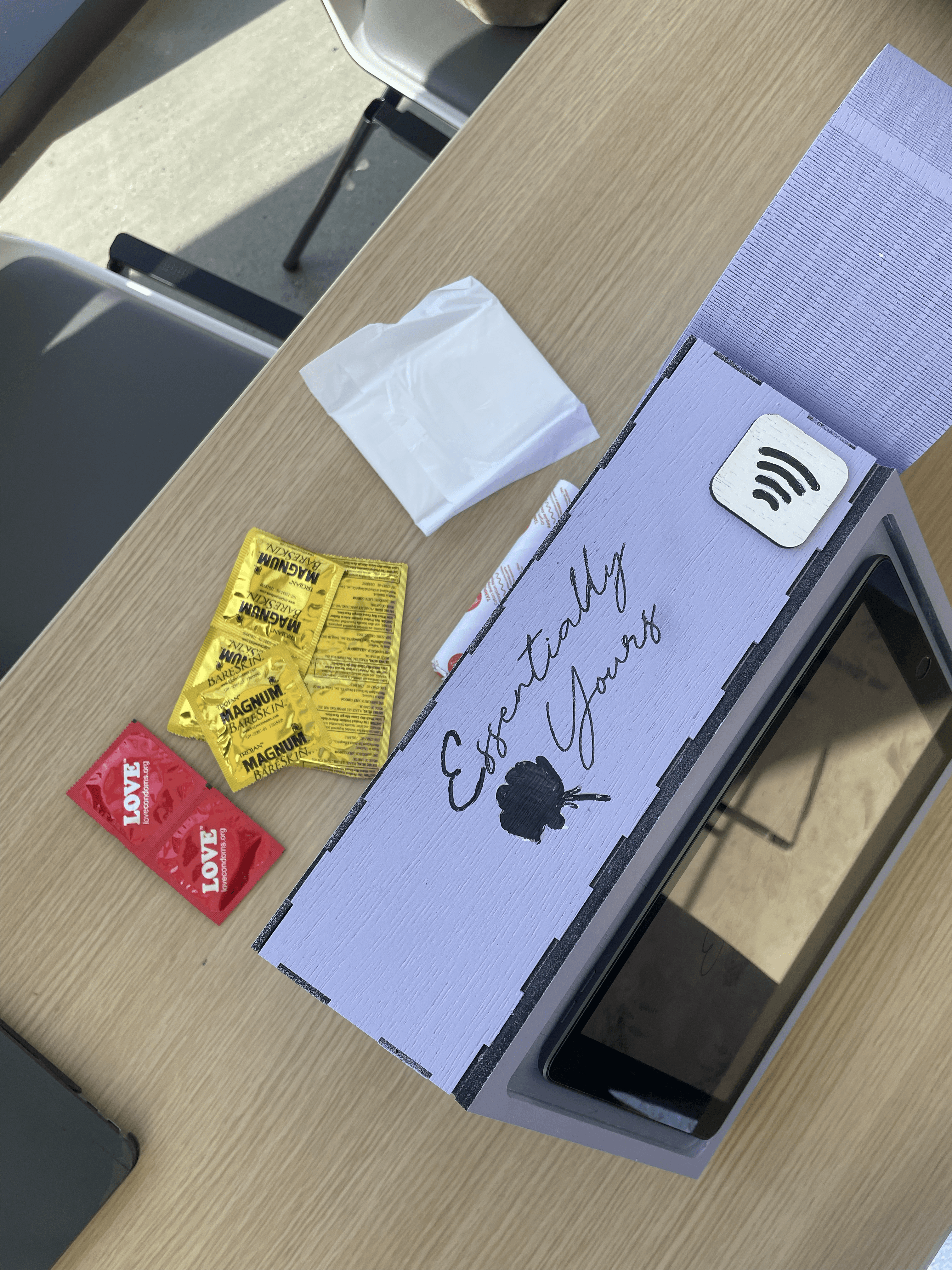
Physical kiosk
Our physical kiosk was designed by my teammate, Emily Nguyen, in Adobe Illustrator. These svg files were used to laser print our physical kiosk.
The main kiosk body and device frame ergonomically supports the device for the digital interface.
The dispensing component was built to simulate an interaction with a vending machine of sorts to receive the products upon checking out.
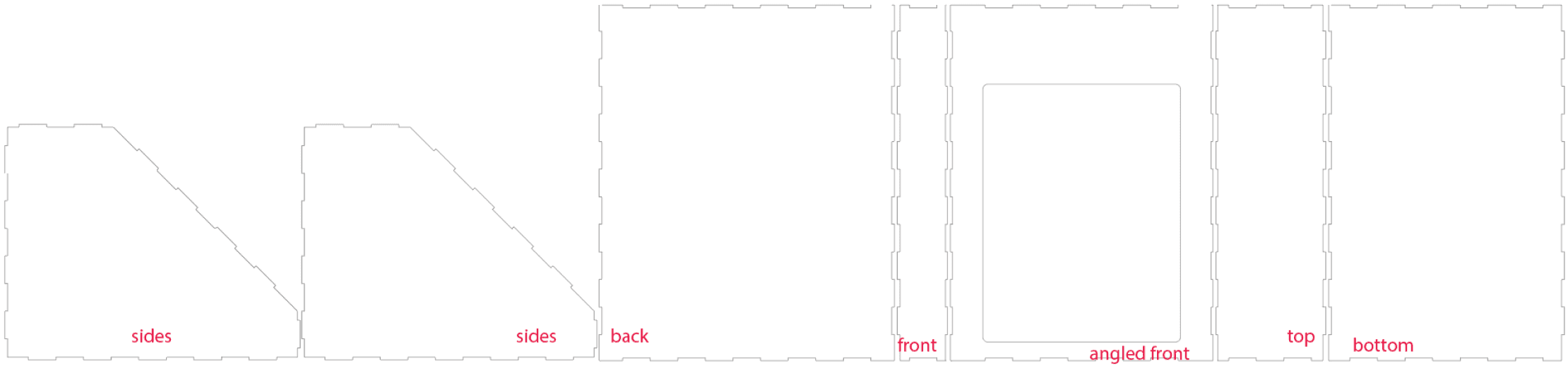
06.1 MAIN KIOSK BODY

06.2 DISPENSING COMPONENT
06.3 DEVICE FRAME
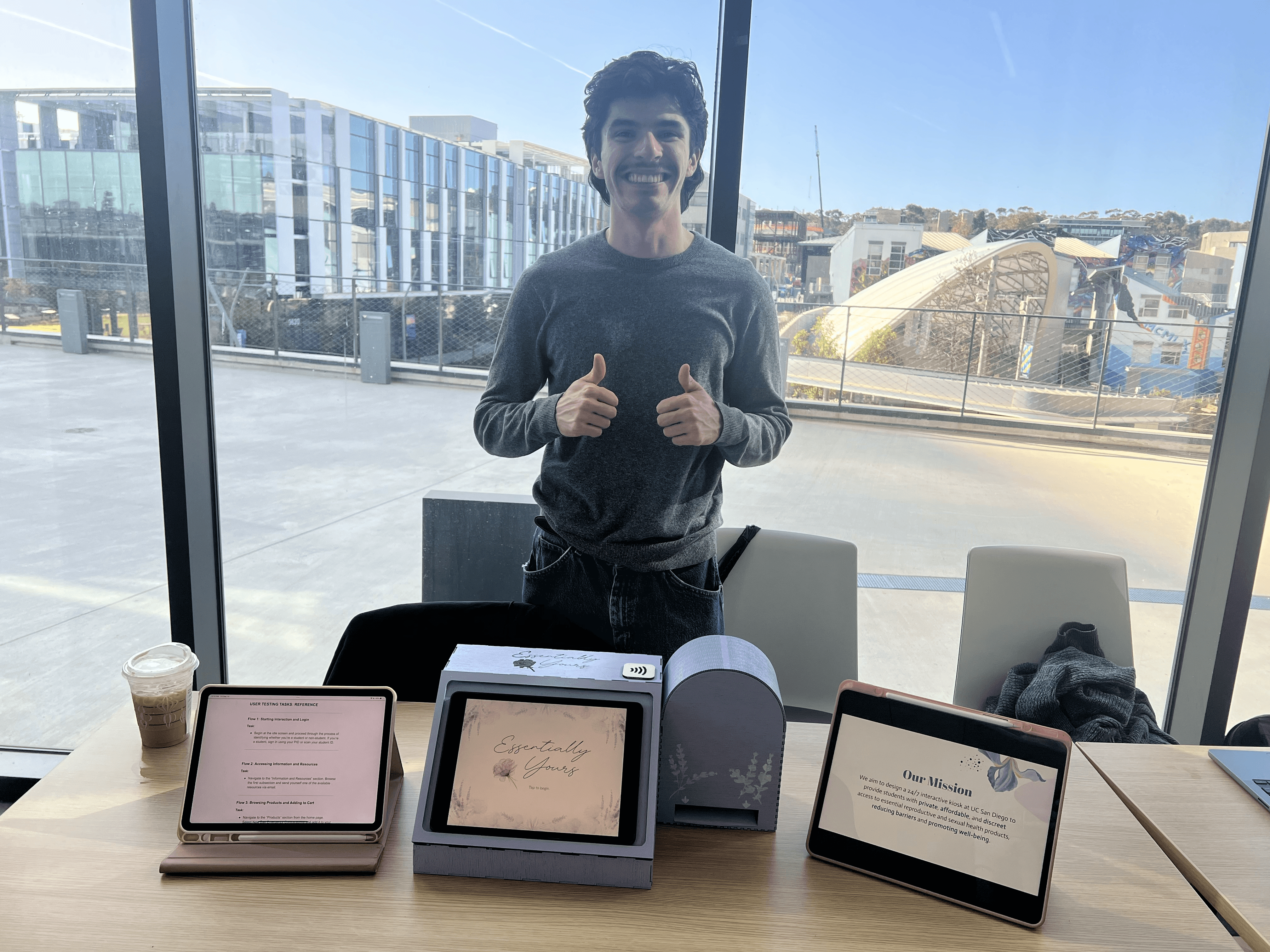
Testing the usability of our high-fidelity kiosk prototype.
Since the hypothetical location of the kiosk is on campus and students are our primary audience, we conducted 3 interviews with current UCSD undergraduate students.
Participants were given 6 tasks with varying pre- and post-task questions to learn more about their thoughts. The interviews were conducted in a semi-structured fashion at the Starbucks located on campus.

PHOTO: PARTICIPANT 01

PHOTO: PARTICIPANT 02

PHOTO: PARTICIPANT 03
Usability testing reveals 5 significant issues.
The problems
Poor cart function discoverability.
All 3 users attempted to remove the product from their cart using the “-” button and were unaware of the drag-left to delete functionality.
The solutions
Using motion to improve discoverability.
When the user enters the screen, the top item is animated to show the red trash button when they swipe left. This signifies that the user can interact with the item by dragging it. [1]
When the user enters the screen, the top item is animated to show the red trash button when they swipe left. This signifies that the user can interact with the item by dragging it. [2]

IMAGE: FIXES AFTER USABILITY TESTING
Input fields were ignored.
All 3 users ignored the input fields for their contact information on the Information and Resources page to send themselves resources.
Add error states and visually distinguish sections.
Differentiate the section’s visual design from the resources. [1]
Add an error state to the button component that doesn’t become active until you input a valid contact. [2]
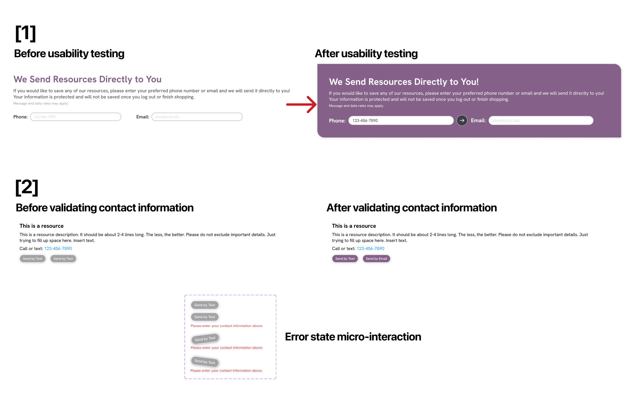
IMAGE: FIXES AFTER USABILITY TESTING
Acknowledgements were ignored.
2 out of 3 users did not select the acknowledgement box before adding a product to the cart or proceeding to checkout.
Introduce intentional friction.
Before the user checks the acknowledgement box, the “Buy Product” and Cart buttons are greyed out (inactive state). [1]
If the user tries to click the buttons in an inactive state, the acknowledgement box shakes to draw the users attention and indicate that they must check the box to proceed. [2]

IMAGE: FIXES AFTER USABILITY TESTING
Uncertainty and confusion in off-boarding.
2 out of 3 users went further than the idle screen after completing their purchase.
Confirmation provides certainty and security.
Visually differentiated the thank you screen and idle screen by adding a button that opens an overlay popup. From here, users can keep browsing or end the session [1].
Foster a stronger sense of confidence that their personal information is protected/not being saved [2].
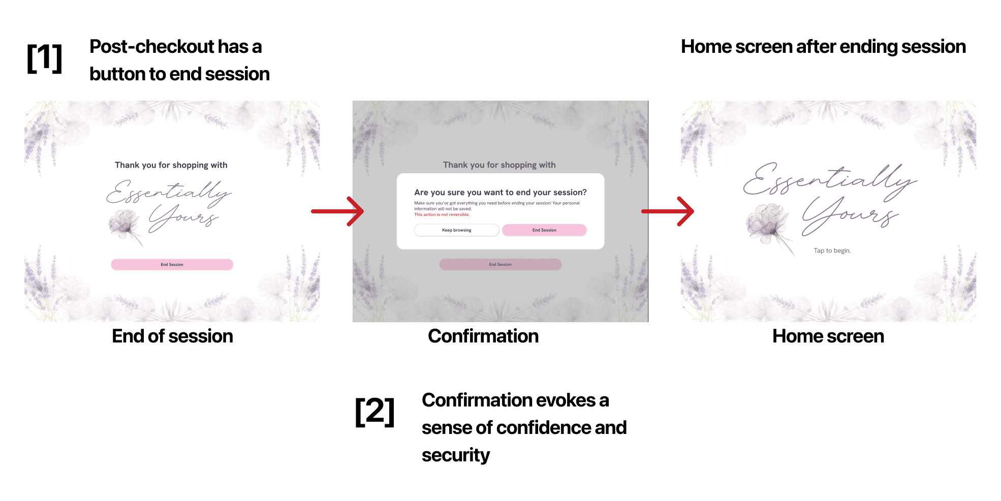
IMAGE: FIXES AFTER USABILITY TESTING
Uncertainty and confusion in off-boarding.
All 3 users did not find the suggested products at the bottom of the Plan B product page.
Add visual indicators to spark action.
Due to time constraints, we were not able to address this issue. Given more time, we would add a scrollbar to the side of the screen or an arrow at the bottom indicating that the screen is scrollable.
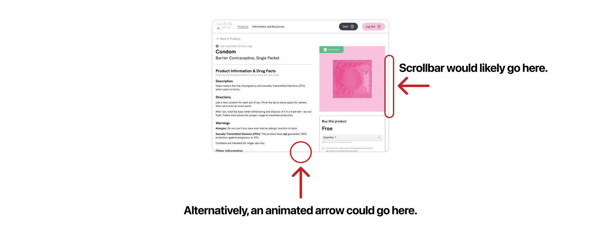
IMAGE: POTENTIAL SOLUTIONS FOR FUTURE ITERATIONS
04. FINAL DESIGN
Essentially Yours Demo
VIDEO: PRODUCT CHECKOUT FLOW
VIDEO: INFORMATION AND RESOURCES FLOW
Onboarding

Idle screen
Welcome screen
Student verification
Home page
Information and resources
Info. and resources page

Resource drop-down sections
Resource error states
Send resources to self
Explore products
Products page


Products page (continued)
Product filter tags
Product description and drug facts

Product description page

Product description page (continued)

Another product description page
Check-out and off-boarding

Checkout cart with items
Animation triggers on entry

Drag or tap “-” to delete item

Empty cart

Payment screen

Off-boarding

Off-boarding confirmation

Mid-flow off-boarding
Physical kiosk

Front view of physical kiosk prototype
Aerial view of physical kiosk prototype
05. REFLECTION
Tackling such a expansive and prevalent issue like reproductive and sexual health accessibility required a significant amount of research and iterating on our designs — which proved to be challenging within a four week timeframe. If I were to further expand this project, here is what I would do next:
Conduct another round of usability testing with our latest prototypes, and present our solution to the professional health advocates from our field research to get additional feedback.
Build out other payment methods to accommodate all payment types.
Prototype another user flow for a user who is not a UC San Diego student or staff member.
Final thoughts and acknowledgements.
Being able to work on a project that centers accessibility to something as crucial as reproductive and sexual health has been an incredible experience. I’ve learned so much about issues in this space and how I can design a solution that would help my loved-ones and people in my community. In addition to the insights I’ve gathered, my role as the lead digital product designer provided me with another opportunity to develop my design-thinking, think outside of the box, and further hone my craft in Figma.
I would like to give a very special thank you to Dr. Bryan Rill, Nel Satriya (TA) , Dave Vo (IA), and Lanka Diunugala (IA) for their continuous support and feedback throughout the entire project. I also would like to thank Hannah Aksamit M.Ed. and the director of Director of Operations at the Beach Area Family Health Center (asked to remain anonymous) for their time and willingness to help us understand the problem space surrounding reproductive and sexual health resources and accessibility.
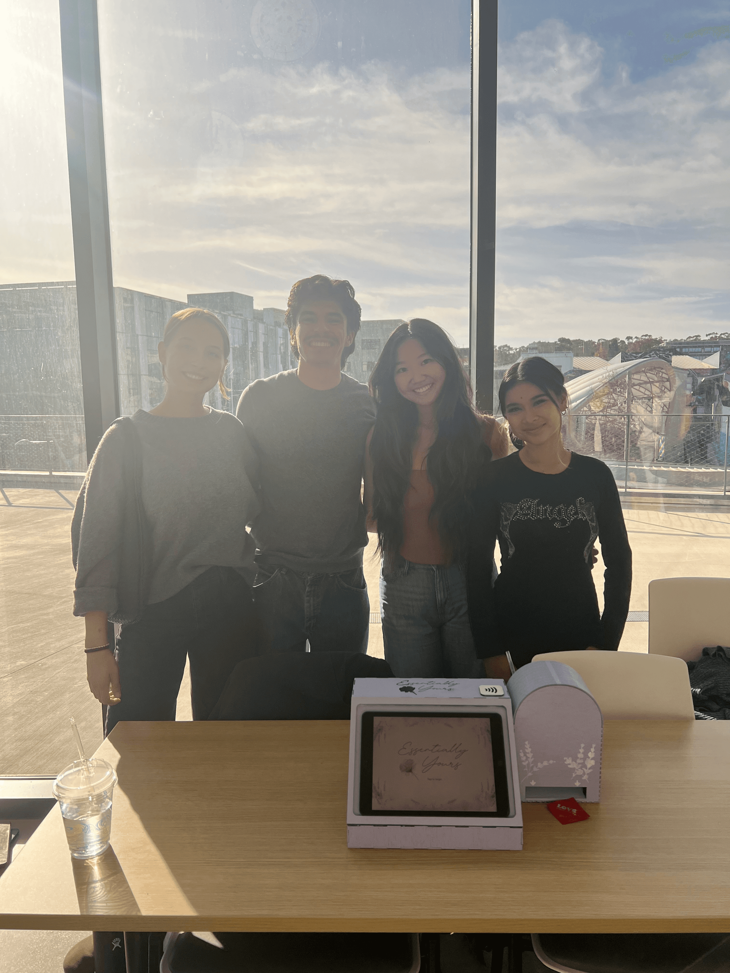
Finally, I’d like to extend my deepest gratitude to my teammates—Emily Nguyen, Marisa Kawakami, and Riley Sether—for all of their hard work throughout this project. :)